Creation of a business club in France
Branding and creation of a visual identity

How do you translate the identity of a new corporate club into a brand?
The agency has been in existence since 2014, but in 2017 when the agency was still called SuccessCom, a new business club was to appear in the community of communes of the Moselle banks in the Grand-Est in France. This club was a request from the local administrations who wanted to have an interlocutor on the entrepreneurial level and allow local companies to network with each other.
We were competing with several other agencies in the area to come up with a logo and graphic design that matched the values and identity of the area. We saw this challenge as an opportunity to develop the visibility of our agency at the local level and under the direction of our CEO, we won this challenge. Mohamed SI AHMED then joined the Rives de Moselle business club as Communication director.
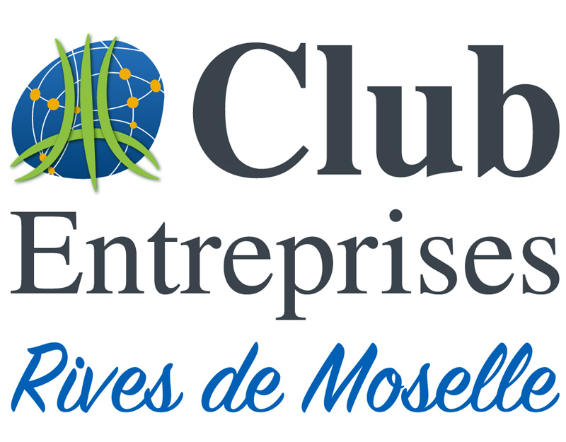
The request of the founding members of the club enterprises rives de Moselle, was to have an atypical logo and which represents the territory of the rives de Moselle being situated between the cities of Metz and Thionville in Moselle. This territory is crossed by several major transport axes which are :
- The A31 freeway
- The A4 freeway
- The railway line where the trains of people and goods transit
- The Moselle river where many barges transit
We have shown these different axes in the green color, which represents the important place of agriculture and forests in the territory. This also demonstrates the societal orientation of the territory. These axes have the shape of the cross of Lorraine used on the logo of the community of communes of the banks of Moselle and they exceed the circle to show the opening on the outside. The blue circle around represents the territory of the banks of the Moselle like the one present on the logo of the community of communes. The blue represents the blue of the river Moselle, but it is also a color that gives confidence and a club is based on the confidence of its members. Finally, the orange dots represent the nine commercial and industrial zones present in the territory and orange is the color of innovation and entrepreneurship. These dots are connected by white lines, which shows the connection between the different areas of the territory.
This logo has existed for almost six years and has not been changed. It represents the territory of the banks of the Moselle from an economic point of view.


After this success, our CEO joined the Club Entreprises Rives de Moselle as communication manager and this allowed the agency to develop locally and to increase its notoriety. We are always close to the Club Entreprises because it has a great place within our agency and to have been able to realize this logo is one of our pride.
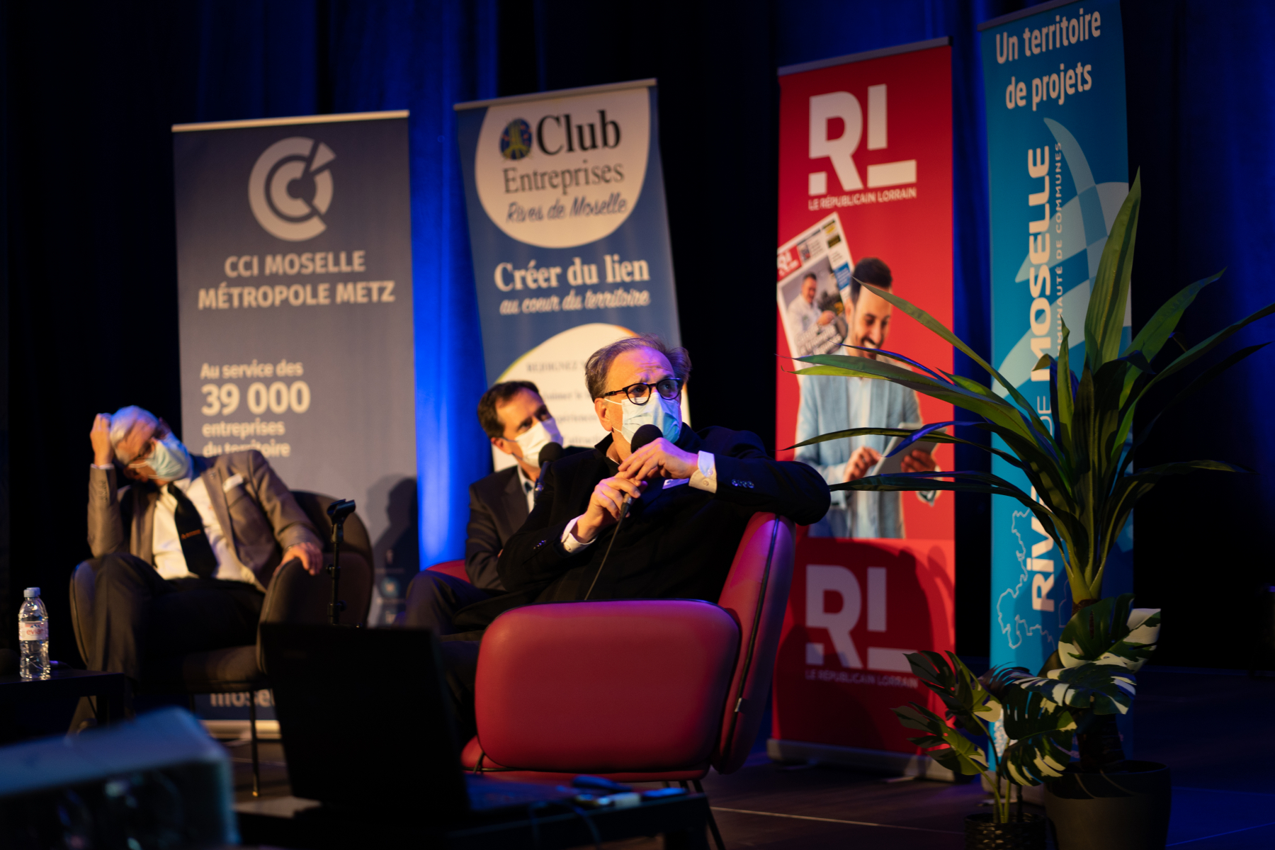
Thereafter, we developed the graphic charter of the business club, taking up the main graphic and visual elements of the club to define the graphic line to follow for the people in charge of the communication. Each element such as the website, the business cards, the flyers, the rollup, the Powerpoint presentations were developed from a design point of view by our agency.
Defining a logo and a brand for a company in the process of being created as was the club entreprises rives de Moselle was a very big challenge for a young agency as was ours. The means of the club were not very important at its creation and we do not leave the causes for which we have consideration aside. We work with large international groups, but also with medium and small companies on a local level, such as startups in their early stages.

